Window Swapping
Is it too much to ask to be able to swap easily between windows?
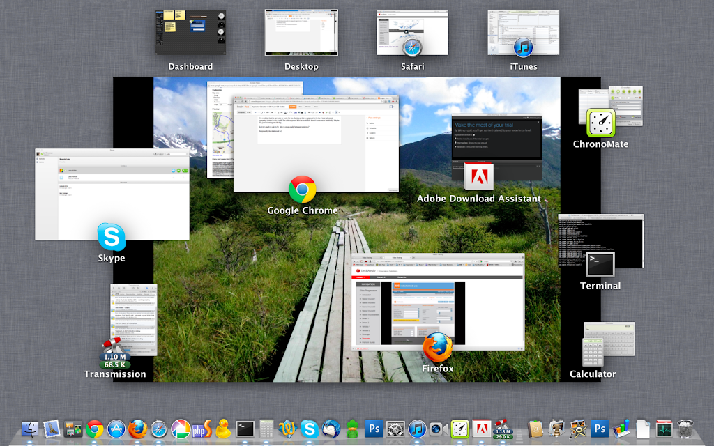
Here’s what my environment looks like at a random moment during the day…
Supposedly the dashboard has solved the ability to quickly navigate between applications, but I’m not convinced. As long as you have multiple windows open within the same application you’re left with an ugly stack of windows (see the Chrome collection in the image above) that’s even more difficult to navigate than it was with Expose.
Seeing as the personal computer is moving away from applications on the machine to applications in the cloud (i.e. run in browsers), I think Apple needs to seriously look at at least handling the multiple tabs / windows that browsers require and providing easy access to them.
Full Screen Apps / Workspaces
On the other hand, I’m a fan of the full screen mode for applications. I’ve been using multiple desktops for some time now and the ability for a single app to take up the entire screen is a welcome addition. Seeing as I do a lot of web development and surfing the web, it’s nice to have the browser full screen and in its own workspace at all times.
I’m feeling a bit outdated, however, with my 2007 MBP because it doesn’t support all of the multi-touch gestures that Lion is built around. The biggest one is the ability to swipe between desktops. I still use the control-arrow key combination. The linear nature of the workspaces, however, is a bit of a drawback.
I used to place my most used application in the center of a grid and supplemental applications in workspaces around that. Made it easy to swap between the main app and helper apps. For example, browser in the center and programming app above and terminal to the right.
I get roughly the same thing with the new dashboard, but have gone back to using apple-tab to swap between applications again.
Finder Windows and Save Dialog Boxes
 |
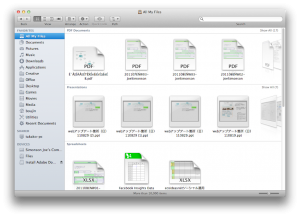
| Yeah! Looks at all those recent files. |
 |
| Easy to get to what I’m working on. |
I love the new “All my files” view option within the finder. Makes it extremely easy to get to the files I’m working on quickly. Same as the “recently modified” search that was in the finder sidebar in Leopard, but more intuitive.
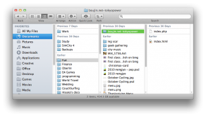
But why can’t this window be standardized throughout the operating system? Seems like I get a different way of displaying my directories with each application I own…
In an Apple application I see the standard side bar and can quickly navigate to where I want to go. Love the “Date last opened” view.
Open Adobe products, however, and I’m left with Adobe’s take on how save dialog boxes should look like. I just can’t understand why this area of the operating system isn’t more standardized. Makes my head spin around in circles each time when I have to come up with different ways to navigate to my files.
Conclusion
Swapping between windows within OS X Lion still leaves a lot to be desired. I’d go as far as saying that the way it was handled in Leopard / Snow Leopard was better.
But if you’re looking to learn a few new tricks, you’ll be able to make the most of the full screen apps feature to reduce the clutter of your working environment.

